


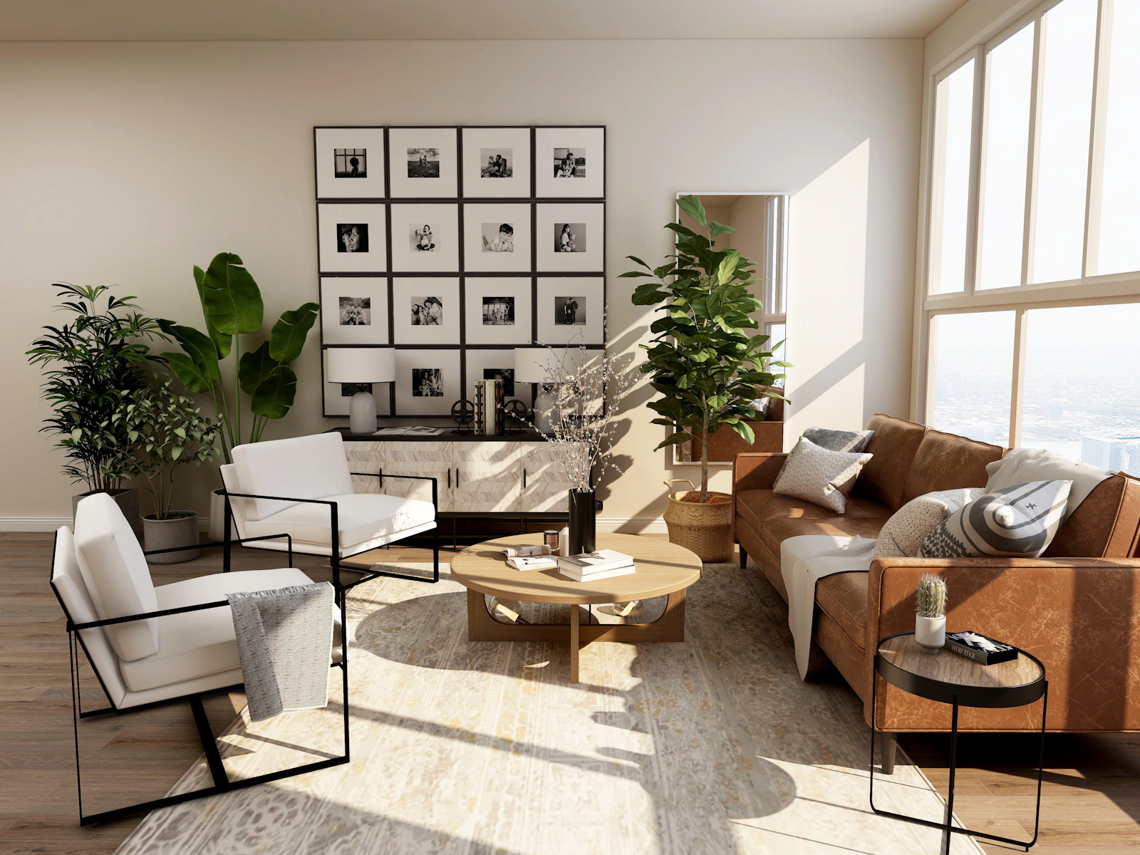
Colour harmony in home decoration is not merely an aesthetic preference; it directly affects how a space is perceived, how light is distributed and the overall feeling of the living area.
The right colour combinations can make a space appear larger, more balanced and more distinctive. When creating colour harmony in a modern home, the main aim is to establish a controlled balance between primary colours, complementary tones and accents.
Understand the Psychological Effect of Colours
Every colour has an emotion and an effect. Blue, for example, evokes calm and serenity, while green strengthens the connection with nature. Beige and earth tones create a warm, balanced and timeless appearance.
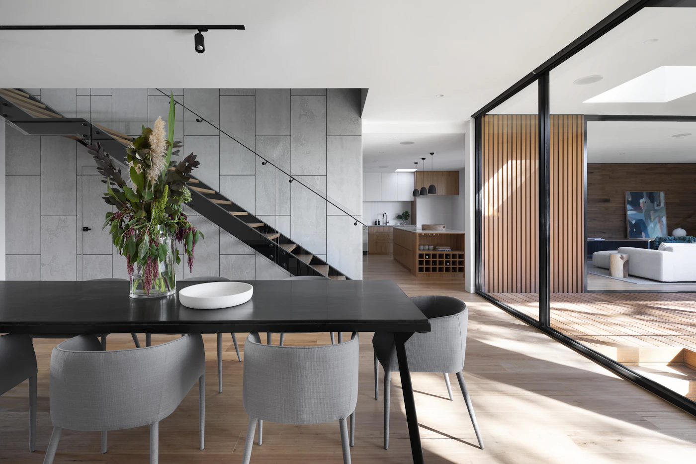
They can be used to create a calmer and more spacious atmosphere.
They add warmth to the space and create strong harmony with natural materials.
They provide a strong foundation for modern and timeless designs.
Create Balanced Combinations with the 60-30-10 Rule
The 60-30-10 rule, frequently used by professional interior designers, is a highly effective method for determining the proportion in which colours should be used within a space.
The main colour group used on walls, large surfaces and flooring.
The second colour used on furniture, curtains and complementary surfaces.
The colour used in accessories, artwork and small decorative details.
Colour harmony is not a coincidence, but a planned balance. When the right tones come together, a space does not only look beautiful; it feels good as well.
Create Harmony Between Material and Texture
When evaluating colours, focusing only on wall paint is not enough. The textures of materials such as wood, natural stone, marble, metal, glass and textiles also change how colours are perceived within a space.


Choose Colours According to the Light in the Space
A tone you like on a colour chart can look completely different in your home. The direction of daylight, window size, the warmth of artificial lighting and the colours of the furniture directly affect this perception.

Before starting the paint application, testing the selected colours on a small area at different times of the day helps prevent possible colour mismatches.
Conclusion
In a successful interior design, colour selection is not considered in isolation. The character of the space emerges when furniture, lighting, natural materials, surface textures and living habits are considered together.
At V Yapı Tasarım, we consider colours in our interior design work not merely as decorative elements, but together with the overall architectural language of the space.


